Icon
Icons are visual indicators usually used to describe action or intent.
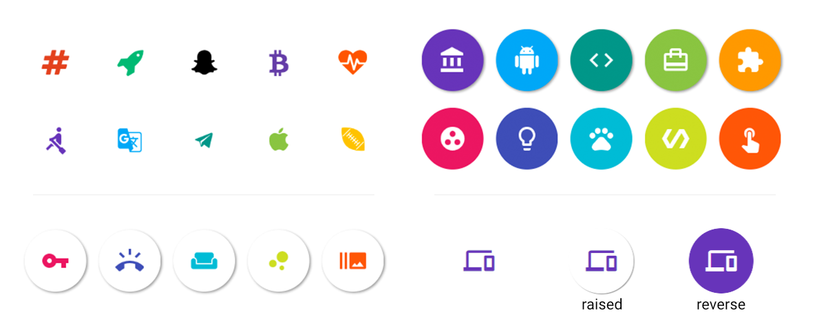
Hint: use reverse to make your icon look like a button
Available Icon Sets#
The icon sets in React Native Elements are made possible through react-native-vector-icons.
The current list of available icons sets are:
- antdesign
- entypo
- evilicon
- feather
- font-awesome
- font-awesome-5
- fontisto
- foundation
- ionicon
- material
- material-community
- octicon
- simple-line-icon
- zocial
Custom Icon Fonts#
Register your own custom icons by calling
registerCustomIconType('customid', customFont). Create a custom font by
following the
instructions for creating a custom font here.
Also, you can use Fontello to generate custom icon
fonts.
Usage#
import { Icon } from 'react-native-elements'
<Icon  name='rowing' />
<Icon  name='g-translate'  color='#00aced' />
<Icon  name='sc-telegram'  type='evilicon'  color='#517fa4'/>
<Icon  reverse  name='ios-american-football'  type='ionicon'  color='#517fa4'/>
<Icon raised name='heartbeat' type='font-awesome' color='#f50' onPress={() => console.log('hello')} />Props#
brandcolorComponentcontainerStyledisableddisabledStyleiconPropsiconStylenameonLongPressonPressraisedreversereverseColorsizesolidtypeunderlayColor
Reference#
brand#
Uses the brands font (FontAwesome5 only)
| Type | Default |
|---|---|
| boolean | false |
color#
color of icon (optional)
| Type | Default |
|---|---|
| string | black |
Component#
update React Native Component (optional)
| Type | Default |
|---|---|
| React Native component | View if no onPress method is defined, TouchableHighlight if onPress method is defined |
containerStyle#
add styling to container holding icon (optional)
| Type | Default |
|---|---|
| View style (object) | inherited styling |
disabled#
Disables onPress events (optional). Only works when onPress has a handler.
| Type | Default |
|---|---|
| boolean | false |
disabledStyle#
Style for the button when disabled (optional). Only works when onPress has a
handler.
| Type | Default |
|---|---|
| View style (object) | {{ backgroundColor: '#D1D5D8' }} |
iconProps#
provide all props from react-native Icon component
| Type | Default |
|---|---|
| {...Icon props} | none |
iconStyle#
additional styling to icon (optional)
| Type | Default |
|---|---|
| View style (object) | inherited style |
name#
name of icon (required)
| Type | Default |
|---|---|
| string | none |
onLongPress#
onLongPress method for button (optional)
| Type | Default |
|---|---|
| function | none |
onPress#
onPress method for button (optional)
| Type | Default |
|---|---|
| function | none |
raised#
adds box shadow to button (optional)
| Type | Default |
|---|---|
| boolean | false |
reverse#
reverses color scheme (optional)
| Type | Default |
|---|---|
| boolean | false |
reverseColor#
specify reverse icon color (optional)
| Type | Default |
|---|---|
| string | white |
size#
size of icon (optional)
| Type | Default |
|---|---|
| number | 26 |
solid#
Uses the solid font (FontAwesome5 only)
| Type | Default |
|---|---|
| boolean | false |
type#
type of icon set. Supported sets here.
| Type | Default |
|---|---|
| string | material |
underlayColor#
underlayColor for press event
| Type | Default |
|---|---|
| string | icon color |