ButtonGroup
ButtonGroup is a linear set of segments, each of which function as a button that can display a different view. Use a ButtonGroup to offer choices that are closely related but mutually exclusive.
Usage#
Using strings#
constructor () { super() this.state = { selectedIndex: 2 } this.updateIndex = this.updateIndex.bind(this)}
updateIndex (selectedIndex) { this.setState({selectedIndex})}
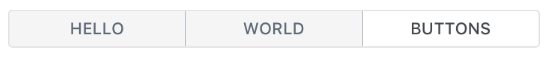
render () { const buttons = ['Hello', 'World', 'Buttons'] const { selectedIndex } = this.state
return ( <ButtonGroup onPress={this.updateIndex} selectedIndex={selectedIndex} buttons={buttons} containerStyle={{height: 100}} /> )}Using components#
constructor () {  super()  this.state = {    selectedIndex: 2  }  this.updateIndex = this.updateIndex.bind(this)}updateIndex (selectedIndex) {  this.setState({selectedIndex})}
const component1 = () => <Text>Hello</Text>const component2 = () => <Text>World</Text>const component3 = () => <Text>ButtonGroup</Text>
render () { const buttons = [{ element: component1 }, { element: component2 }, { element: component3 }] const { selectedIndex } = this.state return ( <ButtonGroup onPress={this.updateIndex} selectedIndex={selectedIndex} buttons={buttons} containerStyle={{height: 100}} /> )}Props#
This component inherits all native TouchableHighlight and TouchableOpacity props that come with React Native TouchableHighlight or TouchableOpacity elements, along with the following:
buttonContainerStylebuttonsbuttonStyleComponentcontainerStyledisableddisabledSelectedStyledisabledSelectedTextStyledisabledStyledisabledTextStyleinnerBorderStyleonPressselectedButtonStyleselectedIndexselectedIndexesselectedTextStyleselectMultipletextStyleunderlayColorvertical
Reference#
buttonContainerStyle#
specify styling for button containers (optional)
| Type | Default |
|---|---|
| object (style) | inherited styling |
buttons#
array of buttons for component (required), if returning a component, must be an object with { element: componentName }
| Type | Default |
|---|---|
| array | none |
buttonStyle#
specify styling for button (optional)
| Type | Default |
|---|---|
| object (style) | inherited styling |
Component#
Choose other button component such as TouchableOpacity (optional)
| Type | Default |
|---|---|
| React Native Component | TouchableOpacity (ios) or TouchableNativeFeedback (android) |
containerStyle#
specify styling for main button container (optional)
| Type | Default |
|---|---|
| object (style) | inherited styling |
disabled#
Controls if buttons are disabled. Setting true makes all of them disabled,
while using an array only makes those indices disabled.
| Type | Default |
|---|---|
| boolean OR number[] | false |
disabledSelectedStyle#
Styling for each selected button when disabled.
| Type | Default |
|---|---|
| View style (object) | Internal Style |
disabledSelectedTextStyle#
Styling for the text of each selected button when disabled.
| Type | Default |
|---|---|
| Text style (object) | Internal Style |
disabledStyle#
Styling for each button when disabled.
| Type | Default |
|---|---|
| View style (object) | Internal Style |
disabledTextStyle#
Styling for the text of each button when disabled.
| Type | Default |
|---|---|
| Text style (object) | Internal Style |
innerBorderStyle#
update the styling of the interior border of the list of buttons (optional)
| Type | Default |
|---|---|
| object { width, color } | inherited styling |
onPress#
method to update Button Group Index (required)
| Type | Default |
|---|---|
| function | none |
selectedButtonStyle#
specify styling for selected button (optional)
| Type | Default |
|---|---|
| object (style) | inherited styling |
selectedIndex#
current selected index of array of buttons (required)
| Type | Default |
|---|---|
| number | none |
selectedIndexes#
current selected indexes from the array of buttons
| Type | Default |
|---|---|
| array (number) | [] |
selectedTextStyle#
specify specific styling for text in the selected state (optional)
| Type | Default |
|---|---|
| object (style) | inherited styling |
selectMultiple#
allows the user to select multiple buttons
| Type | Default |
|---|---|
| boolean | false |
textStyle#
specify specific styling for text (optional)
| Type | Default |
|---|---|
| object (style) | inherited styling |
underlayColor#
specify underlayColor for TouchableHighlight (optional)
| Type | Default |
|---|---|
| string | white |
vertical#
Display the ButtonGroup vertically
| Type | Default |
|---|---|
| boolean | false |