Header
Headers are navigation components that display information and actions relating to the current screen.
Usage#
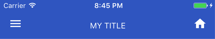
Header with default components#
For quick setup we provide default components, which are React Native Elements Icon for left/right buttons and React Native Text for title. You can customize them with configuration objects passed in as props.
<Header leftComponent={{ icon: 'menu', color: '#fff' }} centerComponent={{ text: 'MY TITLE', style: { color: '#fff' } }} rightComponent={{ icon: 'home', color: '#fff' }}/>Left aligned center component#
<Header placement="left" leftComponent={{ icon: 'menu', color: '#fff' }} centerComponent={{ text: 'MY TITLE', style: { color: '#fff' } }} rightComponent={{ icon: 'home', color: '#fff' }}/>Header with custom components passed in through props#
You can pass in your custom components like this too.
<Header leftComponent={<MyCustomLeftComponent />} centerComponent={<MyCustomCenterComponent />} rightComponent={<MyCustomRightComponent />}/>Header with mixed components#
You can also mix the content, for example you can have default components defined by configuration combined with custom components. Passing a render function that returns a React Element is valid too.
<Header leftComponent={<MyCustomLeftComponent />} centerComponent={this.renderCenterComponent()} rightComponent={{ icon: 'home', style: { color: '#fff' } }}/>Header with custom components passed in as children#
<Header> <MyCustomLeftComponent /> <MyCustomCenterComponent /> <MyCustomRightComponent /></Header>Component precedence#
Components defined through children take precedence over components passed in as props, so in this case <MyCustomLeftComponent> will be rendered instead of leftComponent={{ icon: 'menu' }}.
<Header leftComponent={{ icon: 'menu' }}> <MyCustomLeftComponent /> <MyCustomCenterComponent /> <MyCustomRightComponent /></Header>Header customisability#
We wanted the Header to be as customisable as possible, so you are free to try
different combinations of props. For example, if you want to change the left,
center, or right component's layout, you can adjust the containerStyle
<Header statusBarProps={{ barStyle: 'light-content' }} barStyle="light-content" // or directly leftComponent={<MyCustomLeftComponent />} centerComponent={{ text: 'MY TITLE', style: { color: '#fff' } }} containerStyle={{ backgroundColor: '#3D6DCC', justifyContent: 'space-around', }}/>Props#
containerStylebackgroundColorbackgroundImagebackgroundImageStyleleftComponentcenterComponentrightComponentleftContainerStylecenterContainerStylerightContainerStyleplacementbarStylestatusBarPropsViewComponentlinearGradientProps
Reference#
containerStyle#
styling around the main container
| Type | Default |
|---|---|
| style | none |
backgroundColor#
sets backgroundColor of the parent component
| Type | Default |
|---|---|
| string | none |
backgroundImage#
sets backgroundImage for parent component
| Type | Default |
|---|---|
| object (image) | none |
backgroundImageStyle#
styling for backgroundImage in the main container
| Type | Default |
|---|---|
| style | none |
leftComponent#
define your left component here
| Type | Default |
|---|---|
| { text: string, ...Text props} OR { icon: string, ...Icon props} OR React element or component | none |
centerComponent#
define your center component here
| Type | Default |
|---|---|
| { text: string, ...Text props} OR { icon: string, ...Icon props} OR React element or component | none |
rightComponent#
define your right component here
| Type | Default |
|---|---|
| { text: string, ...Text props} OR { icon: string, ...Icon props} OR React element or component | none |
leftContainerStyle#
styling for container around the leftComponent
| Type | Default |
|---|---|
| style | { flex: 1 } |
centerContainerStyle#
styling for container around the centerComponent
| Type | Default |
|---|---|
| style | { flex: 3 } |
rightContainerStyle#
styling for container around the rightComponent
| Type | Default |
|---|---|
| style | { flex: 1 } |
placement#
Alignment for title
| Type | Default |
|---|---|
| 'left', 'center' or 'right' | 'center' |
barStyle#
Sets the color of the status bar text.
| Type | Default |
|---|---|
| 'default', 'light-content', 'dark-content' | 'default' (source) |
statusBarProps#
accepts all props for StatusBar
| Type | Default |
|---|---|
| { ...StatusBar props } | none |
ViewComponent#
component for container
| Type | Default |
|---|---|
| React Native Component | ImageBackground |
linearGradientProps#
displays a linear gradient. See usage.
| Type | Default |
|---|---|
| {...Gradient props} | none |
LinearGradient Usage#
Using LinearGradient in React Native Elements is supported through the
react-native-linear-gradient
package. If you're using expo or create-react-native-app then you can use
linearGradientProps prop right out the box with no additional setup.
For react-native-cli users, make sure to follow the installation instructions and use it like this:
import { Header } from 'react-native-elements';import LinearGradient from 'react-native-linear-gradient';
...
<Header  ViewComponent={LinearGradient} // Don't forget this!  linearGradientProps={{    colors: ['red', 'pink'],    start: { x: 0, y: 0.5 },    end: { x: 1, y: 0.5 },  }}/>