Card
Cards are a great way to display information, usually containing content and actions about a single subject. Cards can contain images, buttons, text and more.
Usage#
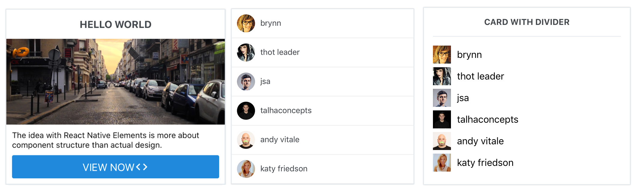
const users = [ {    name: 'brynn',    avatar: 'https://s3.amazonaws.com/uifaces/faces/twitter/brynn/128.jpg' }, ... // more users here]
import { View, Text, Image } from 'react-native'import { Card, ListItem, Button, Icon } from 'react-native-elements'
// implemented without image with header<Card>  <Card.Title>CARD WITH DIVIDER</Card.Title>  <Card.Divider/>  {    users.map((u, i) => {      return (        <View key={i} style={styles.user}>          <Image            style={styles.image}            resizeMode="cover"            source={{ uri: u.avatar }}          />          <Text style={styles.name}>{u.name}</Text>        </View>      );    })  }</Card>
// implemented without image without header, using ListItem component <Card containerStyle={{padding: 0}} >  {    users.map((u, i) => {      return (        <ListItem          key={i}          roundAvatar          title={u.name}          leftAvatar={{ source: { uri: u.avatar } }}        />      );    })  }</Card>

// implemented with Text and Button as children<Card> <Card.Title>HELLO WORLD</Card.Title> <Card.Divider/> <Card.Image source={require('../images/pic2.jpg')} /> <Text style={{marginBottom: 10}}> The idea with React Native Elements is more about component structure than actual design. </Text> <Button icon={<Icon name='code' color='#ffffff' />} buttonStyle={{borderRadius: 0, marginLeft: 0, marginRight: 0, marginBottom: 0}} title='VIEW NOW' /></Card>Props#
Child Components#
Card.Divider#
Receives all Divider props.
Card.Title#
Receives all Text props.
Card.Image#
Receives all Image props.
Card.FeaturedTitle#
Receives all Text props.
Card.FeaturedSubtitle#
Receives all Text props.
Reference#
containerStyle#
outer container style (optional)
| Type | Default |
|---|---|
| object (style) | none |
wrapperStyle#
inner container style (optional)
| Type | Default |
|---|---|
| object (style) | none |